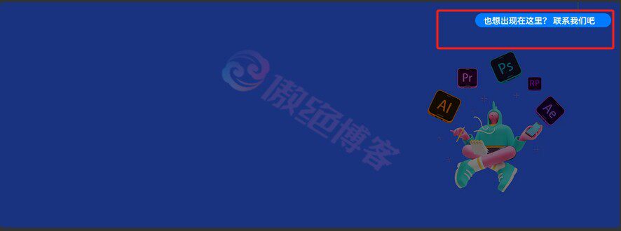
子比主题美化 - 添加创意横幅图片广告位傲绝17天前更新关注私信0486 温馨提示:本文最后更新于2024-04-27 20:43:34,某些文章具有时效性,若有错误或已失效,请在下方留言。 这个横幅广告代码不错,可以点击直达开通会员页面,鼠标放到横幅上可以显示右上角联系我们,感觉还是比较实用的一个广告横幅代码 效果如下 部署:子比后台 >> 自定义 >> 顶部全区块 >> 自定义HTML,CSS代码放到自定义CSS即可 HTML代码 <div class="n_banner_inner"> <div class="img-info">! <div class="info">也想出现在这里? <a rel="nofollow noopener noreferrer" href="https://www.qqij.cn/" target="_blank">联系我们</a>吧</div> </div> <a href="https://www.qqij.cn/user" target="_blank" rel="noopener noreferrer"> <div class="Banner-adTag">广告</div> <img class="tirr" src="www.qqij.cn/1.png" alt="创意横幅图片广告位"> </a> </div> <style> .n_banner_inner { position: relative; } .n_banner_inner .img-info { position: absolute; right: 12px; top: 9px; padding: 0; text-align: right; color: #fff; } .n_banner_inner .img-info i { position: relative; display: inline-block; color: #007bff; font-size: 20px; line-height: 19px; text-align: center; z-index: 9; font-style: inherit; } .n_banner_inner .img-info .info { position: absolute; bottom: 5px; right: 0; width: 0; padding: 5px 0; overflow: hidden; background: #007bff; border-radius: 10px; line-height: 10px; text-align: center; font-size: 10px; color: #fff; white-space: nowrap; -webkit-transition: all 0.2s cubic-bezier(0, 0.34, 0.71, 1.26) !important; -moz-transition: all 0.2s cubic-bezier(0, 0.34, 0.71, 1.26) !important; -ms-transition: all 0.2s cubic-bezier(0, 0.34, 0.71, 1.26) !important; -o-transition: all 0.2s cubic-bezier(0, 0.34, 0.71, 1.26) !important; transition: all 0.2s cubic-bezier(0, 0.34, 0.71, 1.26) !important; } .n_banner_inner .img-info .info a { color: #fff; } .n_banner_inner .tirr { max-width: 100%; height: auto; transition: 0.5s; border-radius: 5px; } .n_banner_inner:hover .info { width: auto; padding: 5px 23px 5px 12px; -webkit-transition: all 0.2s cubic-bezier(0, 0.34, 0.71, 1.26) !important; -moz-transition: all 0.2s cubic-bezier(0, 0.34, 0.71, 1.26) !important; -ms-transition: all 0.2s cubic-bezier(0, 0.34, 0.71, 1.26) !important; -o-transition: all 0.2s cubic-bezier(0, 0.34, 0.71, 1.26) !important; transition: all 0.2s cubic-bezier(0, 0.34, 0.71, 1.26) !important; font-size: 12px; z-index: 1; } .n_banner_inner img:hover { filter: brightness(50%); } /*出发声明hover*/ .n_banner_inner .info:hover a { color: red; text-decoration: none; } .n_banner_inner .Banner-adTag { position: absolute; left: 5px; bottom: 5px; width: 50px; border: 1px solid #ebebeb; border-radius: 3px; color: #ebebeb; opacity: 0.5; font-size: 12px; line-height: 20px; text-align: center; } @media screen and (max-width: 768px) { .n_banner_inner .img-info { display: none; } } .container { width: 100%; } .zib-widget { clear: both; background: var(--main-bg-color); padding: 0px; box-shadow: 0 0 0px var(--main-shadow); border-radius: var(--main-radius); margin-bottom: 20px; } </style> CSS代码 隐藏内容,请登录后查看 © 版权声明 文章作者 傲绝博客 隐私政策 PrivacyPolicy 用户协议 UseGenerator 许可协议 NC-SA 4.0 THE ENDWordPress技术教程网站相关# 子比主题美化# 子比美化教程# 子比美化# 子比主题# 子比教程# 子比教程美化# 子比主题美化 - 添加创意横幅图片广告位 喜欢就支持一下吧点赞6 分享QQ空间微博QQ好友海报分享复制链接收藏